Wednesday, December 18, 2013

Fall Final


I used the tutorial listed bellow and the shape tool to create the snowflakes and the pattern. Simple lines with wight alterations were used for the emphasis on the and and for. I made an image trace of the wreath and deleted the background before making it transparent.

http://www.vectordiary.com/illustrator/snowflakes-tutorial/

Wednesday, November 20, 2013

Packaging design questionair

Branding and Identification Questionnaire
(answer as if you were the client)
Please complete the information about the product for which you are requesting a logo.  This questionnaire helps the designer.  Please answer in complete sentences with as much detail as possible.  Real Life Example Click Me!
Company Name (ex:  Kellogg’s): BeauTeaful Teas
Product Name (ex: Frosted Flakes):  FloraTea
·         What type of product is the design for? tea
·         Explain your product in Detail, use 3-4 complete and articulate sentences : FloraTea is a line of organic flower and fruit infused teas. FloraTea teas come in a variety of tea and flavor combinations, each providing a range of vitamins and antioxidants to contribute to good health. The plethora of flavor combinations ensures that anyone can find the perfect tea for them.
·         Who (age/gender) is your target audience and who is your most ideal customer: teenagers and Young and middle aged women who are concerned with their health.
·         How would you describe your product? Fresh, flavorful and fun
·         What is the overall feeling/message you want your product to convey? Versatile and energetic
·         Do you prefer LogoType or Logo? logo

·         Organic (smooth shapes, natural feel) or Modern ( harsh lines )? organic 


I like the bright colors and the organic feel of the packaging. The black contrasts well with the bright colors of the package.

I like the geometric shapes and the small dashes of bright color. I also like the slight variation between the pattern at the top and how it embodies the type of tea inside the package.
I like how the opening at the top is in the shape of a flower, and how the box has small little details to pull everything together.

Friday, November 15, 2013

Packaging Research

Product Packaging

This is a research report to prepare for your next assignment as a designer.  You will review existing product packaging for it’s values and answer the questions for each product.  You must evaluate the packaging on 4 products.  2 Food and 2 Clothing.  

Define Product Packaging: 

Wikipedia gives 9 purposes for product packaging.  What are they?

1)    Physical protection
2) Barrier Protection
3)Containment
4)information transmission
5)marketing
6)security
7)anti counterfeit packaging
8)convenience
9)portion control

Food Product #1
1) Name of the product: Lays
2) Picture of the Product
3) What is the focus of the product packaging? Making the food appear appetizing
4) What do you like most about the product? The consistency between the various products
5) What do you like least about the product? The name of the individual product looks like it was slapped on without any care to the font
6) List items on the product, list all!  Logo, picture of chips and key ingredients, name of type of chip, ingredients, serving size ect.
7) What kind of packaging does it have?  Bag
 Does it  have one package inside another? No
 8) How many sides of the container are covered with information? All of them
9) Does it have a repeated pattern anywhere on the product? no
10) Why would you pick this product over its competitor? There is a large variation and I know it will taste good
11) What age is the audience of this product? Younger people, college students, high schoolers, or couples with children. 


Food Product #2
1) Name of the product: Hershey’s chocolate
2) Picture of the Product
3) What is the focus of the product packaging? To keep the chocolate from falling apart
4) What do you like most about the product? The simplicity of the design, it is very easy to tell that they are selling chocolate
5) What do you like least about the product? The wrapper can be difficult to open at times
6) List items on the product, list all!  Name of company, name of product, nutrition ingredients, serving size, ingredients, info about the product and company.
7) What kind of packaging does it have?  Paper like plastic wrapping or foil.  have one package inside another? Yes, when many small pieces area in a smaller bag
8) How many sides of the container are covered with information? All of them that are big enough
9) Does it have a repeated pattern anywhere on the product? no
10) Why would you pick this product over its competitor? It’s the most popular and I know its good
11) What age is the audience of this product? Anyone who likes chocolate


Clothing Product #1
1) Name of the product: Gortz shoelaces
2) Picture of the Product (Paste here)
3) What is the focus of the product packaging? To be eye catching and creative, less functional and more pretty looking
4) What do you like most about the product? How original and creative it is, and how it creatively it sells the product
5) What do you like least about the product? It may not look like they are trying to sell shoelaces
6) List items on the package. Logo, brand name, artist name, price and probably some other hidden things.
7) What kind of packaging does it have?  Box
8) How many sides of the container are covered with information? Only one is visible
9) Does it have a repeated pattern anywhere on the product?. no
10) Does it have a slogan or a motivational saying? No, it has a logo
11) Why do they have a slogan or motivation saying?
12) Why would you pick this product over its competitor? It is creative and eye catching, not a boring rectangular package like all of the other brands.
13) What age is the audience of this product? Younger children


Clothing Product #2
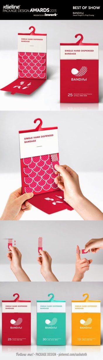
1) Name of the product: BANDiful
2) Picture of the Product (Paste here)
3) What is the focus of the product packaging? To be convenient and eye catching.
4) What do you like most about the product? Its genius and solves a problem that anyone that uses bandaids has experienced
5) What do you like least about the product? It’s a bit bulky, it would be best to have it in a cabinet at home
6) List items on the package.
7) What kind of packaging does it have? Foldable box thing.Does it  have one package inside another?  The bandaids are wrapped inside the box
8) How many sides of the container are covered with information? Definitely the front, the back most likely does too
9) Does it have a repeated pattern anywhere on the product?. Yes, on the bandaid and on the picture on the front
10) Does it have a slogan or a motivational saying? If so, type it out.  no
11) Why do they have a slogan or motivation saying? 
12) Why would you pick this product over- it solves the problem of battling with bandaids and makes it easier to apply them
13) What age is the audience of this product? Parents with young children


Wednesday, November 6, 2013

Personal Logo


For this assignment, I created a logo i would use for myself if i were a graphic designer. I used the first letter of my first name and last letter of my first and last names for the image. The thinning and thickening of the white lines is supposed to look like a pencil stroke, since the beginning of a line is usually thicker than the end of it. The cross in the A is also part of the X, causing the two letters to flow together.

Wednesday, October 23, 2013

Halloween Poster


For this project i used a dark background with orange text to create contrast so the shapes stood out, the same with the dark bats on the light gradient background. I aligned the trees and gravestones along the "ground" so there were no floating stones or trees. I grouped the bats and the tombstones int the same general area to create proximity.

Friday, October 18, 2013

Halloween Text

With this tutorial i learned how to create and manipulate graphics styles, as well as how to use the transform tool and effects. I also improved my problem solving skills because I encountered a lot of strange issues that took a while to figure out.

Thursday, October 10, 2013

Water Pollution Add


I used a neutral brown and solid black to add contrast and draw attention to the text. I used the same font for the text i emphasized, and a different text for the things that are less important. I aligned most of the text to the left and kept a general box like shape for the text. I grouped all the text and straight lines together and the rounder shapes like the water drop in different proximity to create better flow and alignment.

Friday, October 4, 2013

Woof

The easiest step was creating the basic text shape; warping the W and making the paws with the ellipse tool. The hardest part was creating the fur and getting the strokes to look right, along with figuring out which colors look best overall.

Tuesday, October 1, 2013

Lyric Typography

I broke up the lyrics and organized them according to the emphasis used in the song- the words night, silhouette, sweet, and violet were heavily emphasized. To further emphasize the words, i created effects and shape to bring out the meaning. I added a gradient to the word night to make it seem like it was in the dark or shadows. The tapered lines leading into the word silhouette draw attention to it. The word sweet is also emphasized in the song, i created this emphasis with the lines underneath. The word violet is sung in a broken manner, so i spaced the letters further apart to convey this. I used the color purple because the text says the color, and it creates an eerie and mysterious feeling that appears through the song. I made the text white on a black background to emphasize that it takes place at night with the moon shining.
Link to source page: http://www.steampoweredgiraffe.com/suspenderlyrics.html

Tuesday, September 24, 2013

Color Theory Worksheet

Color Theory Worksheet

Please read the materials listed below and answer the following questions:


Please type out answers in complete sentences.  You may paraphrase.  Please do NOT copy and paste definitions. 


  1. Define hue:  distinguishes one color from another
  2. Define value:  the lightness or darkness of a color
  3. Define saturation: the brightness of a color
  4. How many colors are available on our computers?  millions
  5. Define secondary color:  two primaries mixes together
  6. Define tertiary color:  a primary plus a nearby secondary
  7. Define complementary colors:  colors that sit on opposite sides of the color wheel
  8. What are the primary colors in Photoshop?  Red, green, and blue
  9. What are the secondary colors in Photoshop?  Cyan, magenta, and yellow
  10. Define subtractive color model:  based on how inks mix together to create black
  11. Define additive color model:  based on the way light mixes on a computer screen to where when you mix colors it creates white
  12. Is RGB additive or subtractive? additive
  13. Is CMYK additive or subtractive?  subtractive
  14. What is the RGB color model used for? Computer screens
  15. What is the CMYK color model used for?  Prints using ink
  16. Define analogous colors: colors that sit next to each other on the color wheel
  17. Define tint: when white is mixed with a pure color
  18. Define shade:  when black is mixed with a pure  color
  19. Define neutral: combination of complementary colors
  20. What can be said in general about warm colors? They tend to jump out and are prominent
  21. What can be said in general about cool colors?  Tend to recede
  22. What color is associated with stability? blue
  23. What color symbolizes royalty? purple
  24. What is the color of cleanliness? white
  25. What color symbolizes freshness? yellow
  26. Which colors are associated with joy? yellow
  27. What color symbolizes passion and danger?  red
  28. Dark red is associated with: vigor, willpower, rage, courage
  29. Reddish-brown is associated with: harvest and fall
  30. Dark orange is associated with: deceit and distrust
  31. Gold is associated with: prestige, wisdom and wealth
  32. Yellow is associated with: joy, happiness, and energy
  33. Dark green is associated with:  ambition, greed, and jealousy
  34. Olive green is associated with: peace
  35. Light blue is associated with: health, healing, tranquility and softness
  36.  Dark purple is associated with: gloom and frustration
  37. Why is the use of color important in graphic Design? Graphic design is about conveying a message or feeling, and the color itself brings forth strong feelings, so using the right colors can make a message much more meaningful and effective. 

Monday, September 23, 2013

One Word Art

I positioned the word at the top of the canvas because drop usually fall from a high place. I created a path in the shape of a water drop to give the text the appearance of falling water. I edited the size and shape of the rs so that they became larger and slanted toward the center. I edited the d and p  so that they also led into the drop. I moved the i down and made it a bit longer so it looked like a water drop. i positioned the words so that they fell down in a drop-like shape.

Friday, September 20, 2013

Quote

I used shape to create a circular shape with the words "earth" and "art" because the shape of the earth is round. I emphasized the words earth, art, and eh because they are the focal points of the quote, and created less emphasis around the other words because they are not as important.

Monday, September 16, 2013

Glyph Monster

For the glyph monster project i chose to do one of the minions from Despicable Me. I had a little difficulty with figuring out where to place the glyphs, but besides that I had no difficulties.
-source immage

Tuesday, September 10, 2013

Typography Worksheet

Typography Worksheet:
Write out the answers to these questions in complete sentences. 
Typography-anatomy.jpg
Label and define all of the above numbers:
1. ascender line               
2. Base line
3. Ascender height
4. Cap height
5.  descender
6. ascender
7.  X-height
8.cap line
9.  Mean line
10.  Descender line

Define Serif: font style where there are little stickey outey things jutting out from the letters
Define Sans-Serif:  fonts which don’t have stickey outey things
When do you use Antique Fonts? When you wish to evoke a period or historic feel
At most how many words should be Decorative Fonts at a time? 3
What does a script font resemble? handwriting
What element of design does script represent? (From elements lesson) line, space, shape
Why use Symbol Fonts? To embellish or complement texts

Define Typography:  the art and process of arranging type for a variety of media purpses.
Why do designers need a solid foundation in typography? So they know how to utilize text to the fullest and most accurate extent
Kerning: the space in between each individual letter, can be manipulated to make text easier to read
Leading: the space between lines of text, used to give things a greater or smaller sense of space
Tracking: “rivers” of white space in text created by inaccurate alignments
When do you use the following?
Center Alignment: to draw attention to something, such as a headline or title
Right Alignment: crisp and clean, used for professional and corporate media
Justified Alignment:  perfect alignment on both sides, usually in textbooks or newspaper  print
What is remembered: good styling or bad styling? Bad styling is more memorable
What is legibility? The ability to read something clearly
Type size smaller than 7pt is: difficult to read and type
Type size smaller than 3pts is: illegible
Type range for legible type is: 8pt to 14pt
What do you use for long passages? serif
What case do we use for Body? Upper and lower case
What is measure? The width of the text column
What can you tell me about Ragged Edges? Depending on the side alignment, it is more legible or less legible
What are some ways text can be used and what font types do you use for each?
to create a picture, and to create or remove emphasis from certain aspects of an image

Choosing and Using Type:  http://www.will-harris.com/use-type.htm
**Read ALL of it.  Answer the following:
Why is choosing and using the right font important? (Two reasons)
To properly convey the message or idea you are trying to present
To ensure that everything is clear and legible
What are the two most important things to remember?   Type is on  the page to serve the text, and there are no good and bad typefaces
What is appropriate? What do you have to consider?  You should heavily consider the audience; who will be reading it, will they be able to read/understand it, is your goal to appear formal or informal, etc

Tell me the rules:  (there are 10)
1: body text should be between 10 and 12 point
2: use enough leading, always add at least 1 or 2 points to the type size
3: don’t make your lines too short or too long
4: make paragraph beginnings clear
5: use only one space after a period
6: don’t justify text unless you have to
7: don’t underline anything
8: use italics instead of underlines
9: don’t set long blocks of text in italics, bold, or all caps

10: leave more space above headlines and subheads than below them, and avoid setting them in all caps.

Thursday, September 5, 2013

Dirty Water Drop

For this project i used various tools, such as pathfinder and gradient to create many of the effects seen. The pen tool was used to create the wave shape in the middle of the drop. I also created a scatter brush to create the specks floating in the water drop.

Tuesday, September 3, 2013

Peen Tool Practice


Simple Shapes

For this assignment, I mainly used the ellipse tool to create the various shapes, editing it with other tools along the way. I used the knife and shape builder tool to create the more complicated shapes like the shadow on the basketball tool and the curly hair. The transform tool was used to warp ovals to make them look like feet.

Friday, August 30, 2013

The elements of design were applied in different ways here. Line was used for the detailing on the trees and the rungs of the ladder. Many different shapes were used, such as geometric for the sun and organic for the tree. I used line to create texture on the tree, and color and value have been applied throughout the picture.

Wednesday, August 28, 2013

The Elements of Design

  • Line:  Linear marks made with a pen or brush, or the edge created when two shapes meet.
  • Shape: self contained defined area of geometric or organic form. Positive shapes automatically create negative shapes
  • Direction: All lines have direction- horizontal, vertical, or oblique. horizontal suggests calmness, stability, and tranquility. vertical gives a feeling of balance, formality and alertness. oblique suggests movement and action.
  • Size: the relationship of the area occupied by one shape to another
  • Texture: the surface quality of a shape, can be physical or visual.
  • Color: or hue
  • Value: the lightness or darkness of a color.